
How to build an insightful Power BI dashboard: A guide using superstore dataset
This guide uses a superstore dataset, containing sales records, profits, shipping details, and customer information, to demonstrate how to build a powerful dashboard.
By following a structured approach to data loading, transformation, and visualisation, you can generate meaningful insights that drive informed decision-making.
If you’re new to Power BI, check out this article covering the basics.
Understanding the dataset
The dataset we will be working with belongs to a superstore and consists of daily records for each sale made, profit earned, discounts given (if any), shipping information, product names, categories and segments, purchase locations, and customer names.
The dataset contains 9,995 rows and approximately 20 columns.
Please click on this link to download the dataset.
Loading superstore data into Power BI
Let’s move on to the fun part—loading data into Power BI by stepping through the following procedure:
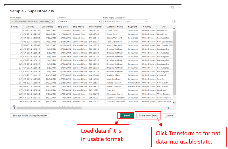
1. Click the ‘Get Data’ button in the Home Ribbon to load your data. A window will pop up, displaying a list of different formats that are allowed.
2. Select the CSV format (since our data is in CSV format), then press the Connect button. Your file explorer will open; select your data file, and wait for the connection to load.
3. Once loaded, the Load and Transform window appears. If you’re certain your data is clean and doesn’t need any wrangling, you can load it directly. However, in this case, we need to transform it.
4. Select the appropriate delimiter (in this case, a comma since it’s a CSV file) and click Transform. This takes you to the Power Query editor.
Transforming data in Power Query
Power Query is a data connection technology in Power BI, Excel, and other Microsoft products that allows you to import, transform, and clean data from various sources before analysing the data.
Please refer to this article for more on data transformation.
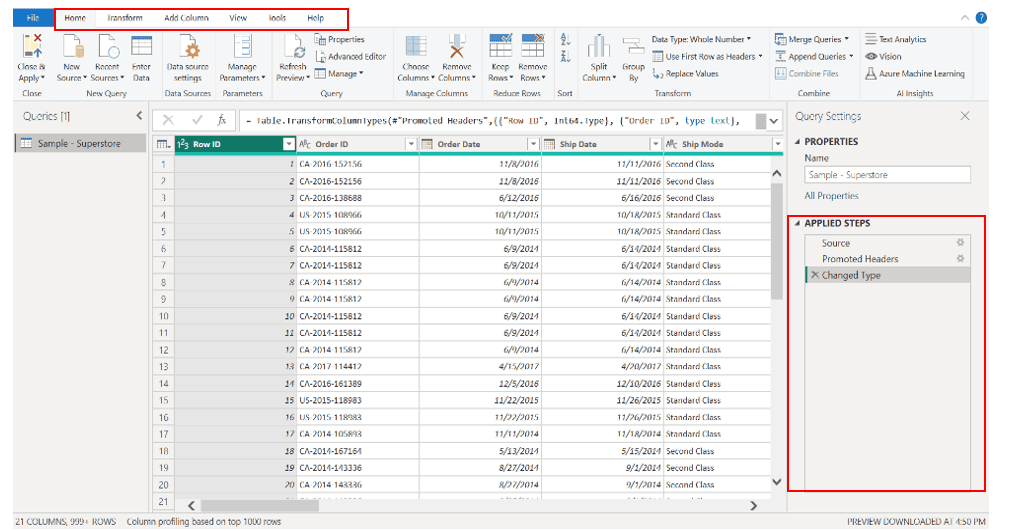
Power Query provides an intuitive interface where you can perform tasks like filtering rows, adding new columns, merging tables, and reshaping data without needing to write code.
Two main components to pay attention to are:
- Applied Steps Pane: Located on the right, this pane keeps track of the steps applied to the data.
- Ribbons: Similar to Power BI, Power Query has ribbons such as Home, Transform, Add Column, View, and Help.
Data transformation: Step-by-step
Let’s get to work transforming our data:
Remove Unnecessary Columns
Begin by removing any columns that are not necessary for your analysis (e.g., IDs, product IDs, postal codes).
To do this, select the columns by clicking on them and choose the Remove Columns button under the Manage Columns tab in the Home Ribbon.
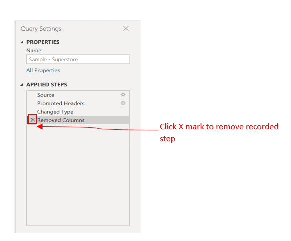
If you accidentally remove the wrong column, you can revert it by pressing the X mark beside the step you want to reverse in the Applied Steps pane.
Create New Columns
We want to create new columns from the date columns, such as extracting the month, quarter, and year, and calculating the processing time (difference between order date and shipping date).
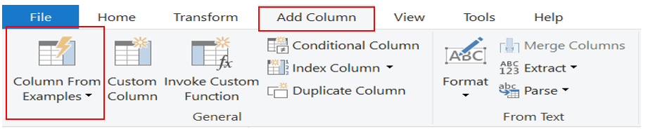
- Adding Columns from Examples: Click the Add Column ribbon and select Column from Examples > From Selection.
Check the boxes beside the columns you want to work with (Order Date and Shipping Date). Then, under the overlapping column titled Column 1, rename the column to Processing Days.
Manually input the calculation for the first 4-5 rows, and Power BI will automatically fill in the rest. Press OK to apply.
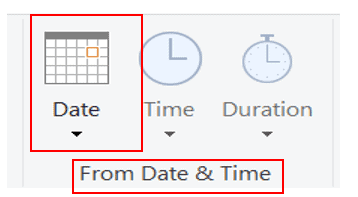
- Extracting Year and Month: Select the Order Date column. In the Add Column ribbon, under the From Date & Time tab, select Date, and choose Year.
Repeat the steps to extract the Month. These columns are now added to your data.
- Removing Duplicates and Blank Rows: Go back to the Home Ribbon. Under the Reduce Rows tab, click Remove Rows and select Remove Duplicates and Remove Blank Rows if there are any.
Once done, click Close and Apply.
Building Your Report
Now that you’ve returned to the Power BI interface, you’re ready to start building your report.
As a beginner, it’s a good idea to recreate existing designs and practice. Once you gain confidence, you can start getting creative with your dashboard layouts. A few tips:
- Stick to a consistent color palette to avoid overwhelming your report with too many colors.
- Don’t overload your report; keep it simple and focused.
Creating Visualisations
Let’s create some visualisations based on the data we’ve transformed. Our focus will be on generating insights into profit trends and making recommendations to the sales department.
We’ll create the following visualisations:
1. Profit per Year
2. Profit per City
3. Profit by Region
4. Profit by Quarter
5. Profit by Customer Name
6. The relationship between Profit and Processing Time
7. Profit per Category
You can start by selecting the visualisation type and then choosing the columns you’re interested in. Alternatively, you can select the columns first and let Power BI decide on a visualisation for you.
You can always modify the visualisation afterward if needed. Let’s begin by selecting the columns we want to plot—in this case, Year and Profit.
Power BI initially assumes that a bar chart is appropriate and plots both values on the same axis.
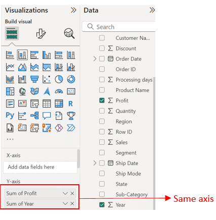
However, that’s not what we need. To fix this, go to the visualisation pane, where you’ll see the X-axis and Y-axis fields.
Currently, both values are under the Y-axis, so drag the Year field to the X-axis. Great! Now we have exactly what we need: Year versus the sum of profits.
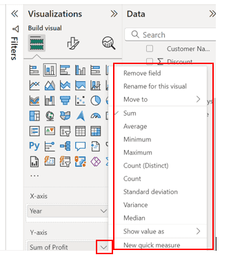
But what if we want to know the average profits per year? That’s easy. In the Y-axis field, click the drop-down next to Profit and select the statistical summary you want.
There are several options to choose from.
This method of plotting can be repeated for all the other charts you need. Let’s say you want to plot by cities and display the top 5 cities by total profit. Here’s how:
1. Deselect Everything on the Canvas: Ensure that nothing is selected in your canvas area.
2. Select Cities and Profit: Go to the data pane and select the Cities and Profit fields. Make sure you choose a bar chart, as it’s the best visualisation for categorical versus numerical data.
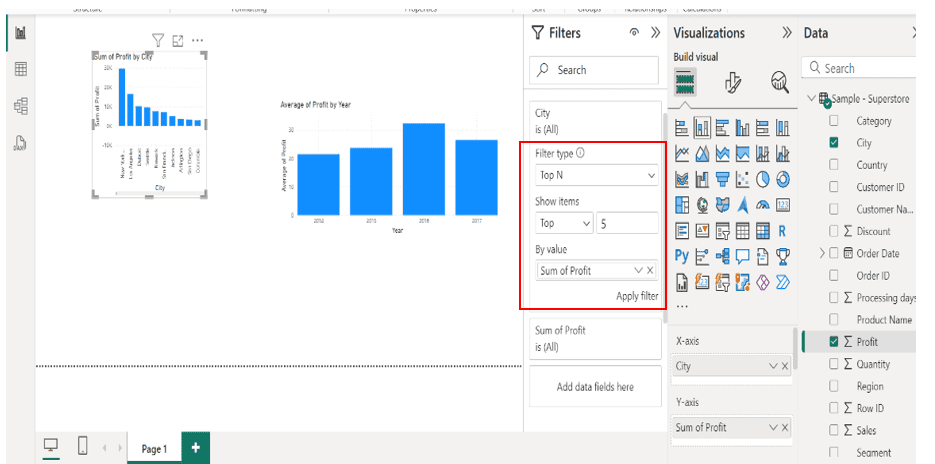
3. Open the Filter Pane: Select your chart. On the filter pane, you’ll see a search field and a list of selected columns. Since we want to plot the Top 5 cities, click the drop-down beside the city field.
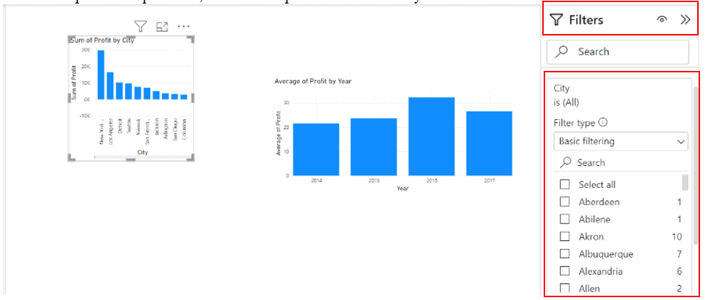
4. Set Up Filtering: The drop-down expands to show the filter type, which is currently set to basic filtering.
Since we care about the Top 5 cities, press the drop-down beside Basic Filtering and select Top N.
5. Choose Top 5: Under “Show items” select Top or Bottom depending on whether you want the lowest 5 or top 5 cities. In the field beside “Show items” enter the number 5.
6. Drag Profit Field to ‘By Value’: Drag the Profit field from the data pane and drop it into the “By value” box, then click Apply Filter. This filters the data as needed.
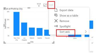
7. Sort the Bar Chart: To arrange the bar charts, hover over the chart, click the three dots, and choose “Sort axis.” You can select ascending or descending, depending on your preference.
There is one more chart I would like to talk about and that is the slicer.
A slicer is a visual tool that allows users to filter data interactively. It acts like a dynamic filter, letting you select specific values or ranges of data to display in your report, making it easier to focus on particular subsets of data.
How to Add a Slicer in Power BI
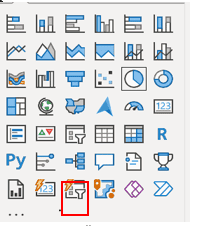
- Select the Slicer Visual: In the visualisation pane on the right side of Power BI, click on the slicer icon (marked red in the picture below).
It looks like a funnel or a drop-down list. Check picture below for a black pen highlight.
- Drag Fields into the Slicer: After selecting the slicer, drag the field you want to filter by (e.g., Year, Category, Region) into the slicer.
- Customise the Slicer: You can adjust the slicer’s settings to allow for single or multiple selections, change the orientation (vertical or horizontal), and format it to fit your report’s design.
Now, onto beautifying your charts:
Polishing Your Chart Designs
- Adjust the Canvas: Ensure all charts are deselected. In the visualisation pane, there’s a brush and paper icon.
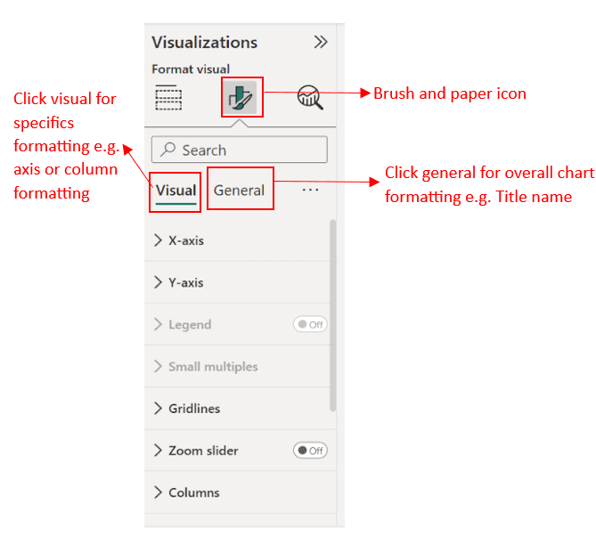
Click on it to see different formatting options. You may increase the canvas size, change the background color, or even add a personal picture as a background.
Since this report will have many charts, I recommend increasing the canvas size. Select “Canvas setting” choose “Custom” under Type and adjust the height and width as desired.
2. Customise Specific Charts: Select the charts you want to beautify. In the visualisation area, find the brush and paper icon. Here, you’ll find two options: Visual and General.
Experiment with both to see how your charts changes.
- Under Visual, you can format X-axis values and titles or choose different colors for each column or line in your chart.
- Under General, you can make overall changes to the chart, not just specific to an axis.
Exploring these options allows you to make personalised choices. Below are my selections and the arrangement I went with. You can also explore published designs on Power BI for more inspiration.
Insights from your report
From this report, these insights could be derived:
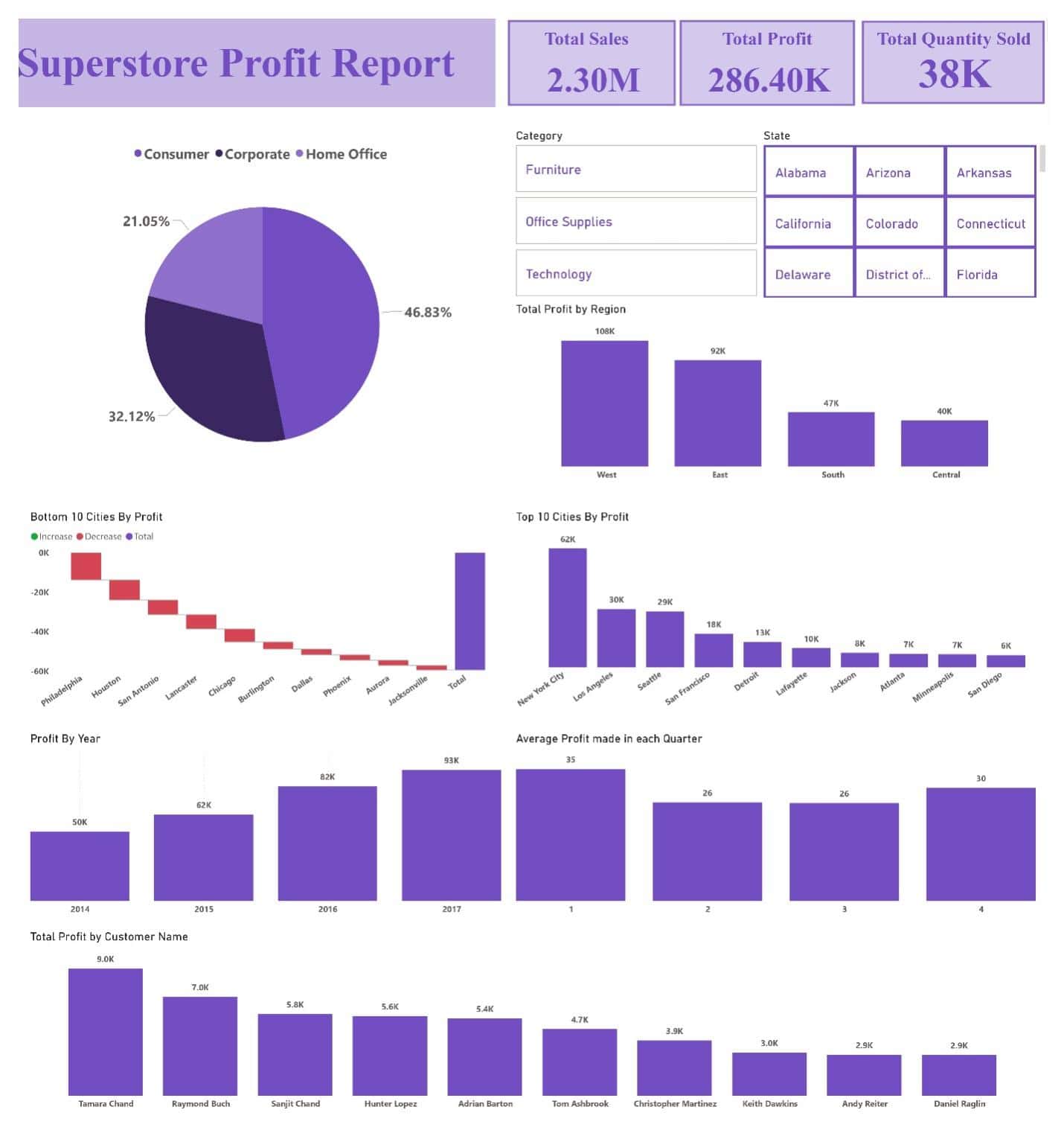
1. Regional Profit Distribution: The West region leads in total profit with 108K, followed by the East with 92K. The South and Central regions trail behind significantly, indicating potential areas for improvement or further analysis.
2. City-Level Performance: New York City stands out as the most profitable city, contributing 62K to the total profit.
In contrast, Philadelphia shows the most significant losses, with a negative profit exceeding 40K, which suggests a need for targeted strategies to turn this around.
3. Product Category and State Filters: The report allows filtering by product category and state, which can provide more granular insights.
For instance, focusing on a specific category like “Furniture” or a state like “California” can help identify which products or locations are driving profits or losses.
4. Yearly Profit Trends: The profit has shown steady growth over the years, peaking in 2017 at 91K.
This indicates a positive trend in overall profitability, though understanding the factors behind the peak in 2017 could be useful for replicating that success in future years.
5. Customer Contribution: Certain customers like Tamara Chand and Raymond Buch are top contributors to profits, with 9K and 7K respectively.
This insight could help in developing strategies for customer retention and personalized marketing.
6. Quarterly Profit Analysis: The average profit per quarter is relatively consistent, with a slight peak in the 4th quarter.
This might indicate seasonality effects, possibly due to holiday sales, which could inform future sales and marketing strategies.
7. Profit Distribution by Segment: The consumer segment accounts for nearly half of the profits (46.83%), making it the most significant contributor, followed by corporate (32.12%) and home office (21.05%).
This suggests a strong reliance on consumer sales.
Summary and recommendations
From these insights, the following recommendations can be made:
1. Focus on Under-performing Regions: Since the West and East regions are the top performers, efforts should be directed towards the South and Central regions.
The sales team could develop targeted strategies, such as localised promotions or partnerships, to boost sales in these underperforming areas.
2. Address the Decline in Certain Cities: Cities like Philadelphia, Houston, and San Antonio are showing significant losses.
The sales team should investigate the reasons behind these declines, such as potential competition, customer preferences, or economic factors, and develop strategies to counteract these losses.
This might include special offers, better customer engagement, or adjusting product offerings to better suit local demands.
3. Leverage Top-Performing Cities: New York City, Los Angeles, and Seattle are driving significant profits.
The sales team should reinforce these strongholds by maintaining customer satisfaction, offering exclusive deals, or introducing loyalty programs to retain and grow this customer base.
4. Enhance Customer Relationships: The top customers, like Tamara Chand and Raymond Buch, are significant contributors to the store’s profits.
The sales team should focus on building and maintaining strong relationships with these high-value customers through personalised offers, premium services, and loyalty programs.
5. Capitalise on Seasonal Trends: The slight increase in profits during the 4th quarter suggests potential seasonality in sales.
The sales team should plan ahead for these periods by ramping up marketing efforts, stocking up on high-demand products, and offering seasonal promotions to maximize sales.
6. Optimise Product Mix by Region and Category: Use the filters in the report to analyse which product categories perform best in specific regions.
Tailoring the product mix to regional preferences can help increase sales.
For instance, if certain categories like “Technology” or “Office Supplies” perform better in specific states, the sales team should focus on promoting these products there.
7. Reduce Focus on Less Profitable Segments: The report shows that the “Home Office” segment contributes the least to profits.
The sales team should evaluate whether it makes sense to continue focusing on this segment or if resources should be reallocated to more profitable areas.
To export your Power BI report, you can save it as a PDF or in PBIX format.
If you have a Microsoft account, you can also publish your report to Microsoft Power BI service for others to view and interact with.
Wrapping up
Key insights from the superstore dataset include identifying top-performing regions, cities, and customer segments.
By focusing on under-performing areas, leveraging successful strategies, and optimising the product mix, businesses can enhance their performance.
This tutorial not only equips beginners with the tools to create insightful dashboards but also underscores the importance of data-driven strategies for business growth.
This brings us to the end of our tutorial. I hope you found it helpful! Until next time, take care and goodbye!