
Data visualisation using Power BI: Key takeaways
Introduction
Insights can be communicated through written reports, visualisation reports, or dashboards.
Visualisations are key in data analysis, and it’s common to see the terms “reports” and “dashboards” used interchangeably, even though they serve different purposes.
Reports vs. Dashboards
Reports provide detailed, static data, often with a focus on historical or specific information. They are used to dive deep into particular areas, presenting data in a structured format.
Dashboard on the other hand, offer a high-level, real-time or near-real-time overview of key metrics and KPIs. Dashboards are interactive and designed for quick insights.
In all, while reports are typically used for in-depth analysis of historical data, dashboards emphasize ongoing monitoring with real-time or near-real-time data.
Data visualisation tools
There are several business intelligence tools available for creating both reports and dashboards, such as Microsoft Excel, Tableau, Looker, Qlik, Power BI, etc. In this tutorial, we will focus on the Power BI interface.
To download Microsoft Power BI, please visit their official website: Microsoft Power BI. This article contains procedure on how to install Power BI.
Since Power BI is a Microsoft product, its interface is similar to that of MS-Excel, making it familiar for users with experience in Excel.
Preparing to build a report
It’s important to consider a few key factors before building a report on a new dataset. As a data analyst, you should start by defining what you are trying to communicate.
This will help you quickly determine the focus areas within the data. Here are two essential questions to keep in mind:
- What are you hoping to communicate?
- Who are you communicating it to?
Power BI Interface components
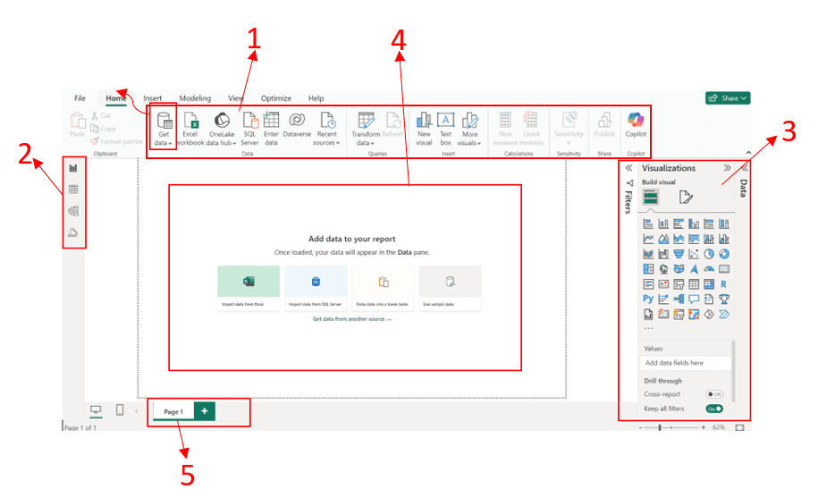
Home Ribbon
The Home Ribbon (marked as number 1 in the figure below) includes essential tools for importing and querying data, as well as creating visualisations.
It’s the starting point for most tasks, featuring options for connecting to data sources, inserting visuals, and applying filters.
Other important ribbons include Insert, Modeling, View, Optimise, and Help. You’ll get familiar with these as you progress in the usage of Power BI.
Navigation Pane
The Navigation Pane (marked as number 2 in the figure below) on the left side allows users to switch between different views—Report, Data, Model, and DAX views.
It also provides access to recent files, workspaces, and shared reports within your organization.
The Right Pane
The Right Pane (marked as number 3 in the figure below) consists of the Data, Visualisation, and Filter panes.
The Data Pane lists all the data tables and fields available for use in your report. You can drag and drop these fields into visualizations to explore your data.
The Visualisation Pane includes all the visualisation types you can create, like bar charts, line charts, maps, and tables, along with formatting options.
Finally, the Filter Pane allows you to apply filters at various levels—report, page, and visual—to narrow down the data displayed in your visualisations.
Report Canvas
The Report Canvas (marked as number 4 in the figure below) is the central workspace where you build and design your reports.
This large, blank canvas is where you add and arrange your visualisations, creating interactive reports by combining multiple data views.
Pages Tab
Located at the bottom, the Pages Tab (marked as number 5 in the figure below) lets you manage multiple pages within a single report.
You can add new pages, rename them, and navigate between different sections of your report.
Wrapping up
Understanding the distinction between reports and dashboards is key to effective data analysis. Reports provide detailed historical insights, while dashboards offer real-time views for quick decision-making.
Power BI’s user-friendly interface, similar to MS-Excel, allows for the creation of both, helping analysts present data in a clear, impactful way.
Mastering Power BI’s features will enable you to build interactive reports and dashboards that effectively communicate key insights to your audience.